We have compiled a collection of informative articles covering a range of topics related to usability testing, user-centered design, and more, with a focus on quantitative data and analysis.
Each article is centering around a concept of usability, describing it from a quantitative data and analysis approach. A list of resources for anyone involved in creating digital products and services with valuable insights and practical tips to enhance the user experience.
TL;DR: The Self-Assessment Manikin (SAM) is a valid and reliable picture-based measurement of perceived emotion. Emotion is measured in three dimensions (Pleasure, Arousal, Dominance), but the Dominance dimension is not usually needed.
But how do we measure emotion? That’s the question the Self-Assessment Manikin (SAM) is answering. More specifically, SAM measures perceived emotion. Emotion measurement dates considerably before Human-Computer Interaction’s existence; naturally, SAM has its roots in psychology and emotion measurement in a psychological context. It was introduced in 1980 by Peter J. Lang. As a matter of fact, a large dataset of studies utilising SAM to measure perceived emotion has used pictures, audio, and nouns (words). However, in measuring aspects of Interaction Experience (IX), we find it useful to also measure perceived emotion (for example).
Setting up the SAM
The questions of SAM
The Self-Assessment Manikin is different from the questionnaires we normally use in IX measurement in that it consists of pictures. Five pictures and a blank space in between them that represents the in-the-middle values are organised in a 3-row format; each line is one dimension: Pleasure, Arousal and Dominance. There is also a variant (the original version) that includes only 5 pictures per line, without the in-the-middle boxes.
The first line measures pleasure (valence): from (left) feeling very happy, to (right) feeling very unhappy. (This is the initial ordering of items, although some publications use the reverse order)
The second line measures arousal (how strong the feeling is): from (left) a very tense feeling to (right) a very calm feeling. (Once again, this is the initial ordering of items, although some publications use the reverse order)
The third line measures dominance: from (left) submissiveness to (right) dominance
Participants can rate their affective state (emotion) by placing an X in one box per line.
In analysis, the leftmost manikin is coded with the number -8 and moving to the box on its right adds 2. So the equivalent numerical values for each dimension (with in-the-middle values) are: -8, -6, -4, -2, 0, 2, 4, 6, and 8.
For the first line, pleasure, -8 represents a very happy feeling, 0 represents feeling neither happy nor unhappy, and 8 represents a very unhappy feeling
For the second line, arousal, -8 represents a very tense feeling, 0 represents a feeling neither tense nor calm, and 8 represents a very calm feeling
For the third line, dominance, -8 represents a very submissive feeling, 0 represents neither a dominant nor a submissive feeling, and 8 represents a very dominant feeling
The participants don’t see the numbers; we only use them to code the responses for analysis.
Calculating the SAM score
Given that there is no single SAM score, we interpret the three replies of each participant as a triple that describes the perceived affective state in a three-dimensional plane.
So, calculating the score for the emotional response that an interaction with a system, product, or service elicits is a matter of averaging all replies for each of the dimensions, not forgetting to also state standard errors. We can also use statistical analysis tools to automate the process (for example, IX Calculator offers both the original three-dimensional, and the current two-dimensional version). Then we interpret the results using the equivalence between the numbers and the affective state for each dimension (above).
For example, if we have the replies of 50 participants after an interaction with a product, and we calculate the averages as: average(Pleasure) = -6.4, average(Arousal) = -4.5 and average(Dominance) = 1.0, we can interpret it as that the product, on average, was very pleasurable to use, arousing, and that participants felt dominant during their use.
The distribution of emotions in a two-dimensional space
Even though all numerical combinations of Pleasure–Arousal are theoretically possible, in practice, measured emotion appears as a U-curve when plotted on a Pleasure-Arousal space and can be modelled with a quadratic function. That highlights the difficulty of the appearance of emotions that are felt as either very happy and very calm, or very unhappy and very calm. At the same time, emotions that are considered very calm tend to be neutral in terms of pleasure.
TL;DR: UEQ is a 26-item questionnaire that measures reliably the Pragmatic Quality and Hedonic Quality of a product. Five other sub-dimensions have been proposed but literature is torn in their validity. UEQ provides a benchmark for comparing a system scores with normative data for a collection of other systems.
Defining UX has been, and to some extent still is, tricky. In their 2006 publication, Laugwitz, Schrepp, and Held introduced the User Experience Questionnaire (UEQ), originally developed in German (and later adapted into English). As a working definition of UX, the UEQ builds on Hassenzahl’s theory that users perceive a product through Pragmatic and Hedonic qualities. Pragmatic Quality emphasises how well a product supports users in achieving task-related goals with effectiveness and efficiency, whereas Hedonic Quality emphasises the product’s role in psychological well-being, stimulation, and identity expression. UEQ has shown promising psychometric properties, but more research is needed to evaluate the dimensions it is measuring.
Setting up the UEQ
The questions of the UEQ
The UEQ consists of 26 items, presented as pairs of opposite adjectives on a 7-point semantic differential scale ranging from 1 to 7, with 4 representing neutrality. Each item asks participants to rate the product somewhere between two extremes. Some items are positively worded (where higher scores indicate better UX), while others are negatively worded (where higher scores indicate worse UX).
The labels of the 26 semantic differential items are:
Annoying – Enjoyable
Not understandable – Understandable
Creative – Dull
Easy to learn – Difficult to learn
Valuable – Inferior
Boring – Exciting
Not interesting – Interesting
Unpredictable – Predictable
Fast – Slow
Inventive – Conventional
Obstructive – Supportive
Good – Bad
Complicated – Easy
Unlikable – Pleasing
Usual – Leading edge
Unpleasant – Pleasant
Secure – Not secure
Motivating – Demotivating
Meets expectations – Does not meet expectations
Inefficient – Efficient
Clear – Confusing
Impractical – Practical
Organized – Cluttered
Attractive – Unattractive
Friendly – Unfriendly
Conservative – Innovative
The translations and some adaptations can be found on the UEQ website.
The overall score of the UEQ (the product’s score)
There is no single “overall UEQ score”. Instead, the questionnaire is interpreted through three overarching qualities and six sub-dimensions. However, if we are really after an overall score we can use the score of the Attractiveness scale, which also should be approximately (Pragmatic + Hedonic) / 2.
We will assume in the calculation formulas below that all replies are in the range of 1 to 7.
The product’s Attractiveness score
To get the Attractiveness score for each participant:
Add items 1, 14, and 16
From the number 24, subtract items 12, 24, and 25
Add the two numbers from the previous steps, divide by 6, and subtract 4
To get the overall Hedonic Quality score, calculate the mean of all participants’ scores.
The five sub-dimensions of the UEQ
The Pragmatic and Hedonic dimensions are further broken down into 5 sub-dimensions. Even though these dimensions were reported in the initial publications, recent research has shown mixed results in replicating them (e.g. research by Schankin et. al). The five sub-dimensions were introduced to help pin-point which aspects of the product need to be improved, for the time being, we suggest interpreting these dimensions with caution.
Pragmatic Quality dimensions:
Perspicuity (ease of learning and clarity):
To get the Perspicuity score for each participant:
Add items 2, and 13
From the number 16, subtract items 4, and 21
Add the two numbers from the previous steps, divide by 4, and subtract 4
To get the overall Novelty score, calculate the mean of all participants’ scores.
Understanding the UEQ’s score
Benchmarks
The UEQ provides a benchmark dataset based on 21175 evaluations of 468 products across industries. These benchmarks can be used to compare the results from the product we are evaluating with the products in the dataset and help put a “label” to our numbers. The authors of the UEQ have provided a percentile rank (similar to SUPR-Q) that can be interpreted per subscale as shown on the tables below:
Benchmark for Attractiveness
Percentile
Mean
Label
< 25%
–
Bad
25%
0.69
Bellow Average
50%
1.18
Above Average
75%
1.58
Good
90%
1.84
Excellent
Benchmark for Perspicuity
Percentile
Mean
Label
< 25%
–
Bad
25%
0.72
Bellow Average
50%
1.2
Above Average
75%
1.73
Good
90%
2
Excellent
Benchmark for Efficiency
Percentile
Mean
Label
< 25%
–
Bad
25%
0.6
Bellow Average
50%
1.05
Above Average
75%
1.5
Good
90%
1.88
Excellent
Benchmark for Dependability
Percentile
Mean
Label
< 25%
–
Bad
25%
0.78
Bellow Average
50%
1.14
Above Average
75%
1.48
Good
90%
1.7
Excellent
Benchmark for Stimulation
Percentile
Mean
Label
< 25%
–
Bad
25%
0.5
Bellow Average
50%
1
Above Average
75%
1.35
Good
90%
1.7
Excellent
Benchmark for Novelty
Percentile
Mean
Label
< 25%
–
Bad
25%
0.16
Bellow Average
50%
0.7
Above Average
75%
1.12
Good
90%
1.6
Excellent
For example a product that has an attractiveness score of 1.21, is perceived as having better attractiveness than 50% of the products in the dataset, and worse than 25%. We can label it then as “Above Average” regarding its attractiveness.
TL;DR: SUPR-Q is a measurement of a website’s UX that is broken down into 4 aspects: Usability, Trust, Loyalty, and Appearance. It uses 8 questions and has initially shown to be correlated with the SUS and that it has a good factor structure.
Talking about web design, user experience (UX) is a crucial factor that determines a website’s success. Usability can be measured in many ways, but what about UX overall? To answer this question about measuring UX and its aspects effectively, the Standardized User Experience Percentile Rank Questionnaire (SUPR-Q) was developed. Introduced in 2015 by Jeff Sauro, the SUPR-Q comprises eight questions that measure four key aspects of UX: usability, trust, appearance, and loyalty. It demonstrates high reliability (α = 0.86) and high concurrent validity with the System Usability Scale (r = 0.87).
Setting up the Standardized User Experience Percentile Rank Questionnaire
The questions of SUPR-Q
The eight questions of the questionnaire are:
The website is easy to use.
It is easy to navigate within the website.
I feel comfortable purchasing from the website (or The information on the website is credible.)
I feel confident conducting business on the website (or The information on the website is trustworthy).
How likely are you to recommend this website to a friend or colleague?**
I will likely return to the website in the future.
I find the website to be attractive.
The website has a clean and simple presentation.
The Responses of SUPR-Q
All questions are scored on a 5-point Likert Scale (1= strongly disagree and 5 = strongly agree), except for item 5 which is scored on an 11-point Scale (0 = not at all likely and 10 = extremely likely) to align with how Likelihood to Recommend is calculated.
Calculating the SURP-Q Score
The Holistic Score
To calculate the SUPR-Q score of each participant:
Sum all questions except question 5
Multiply question 5 by 0.5 and add the result to the total sum
Divide by 8
To derive the overall SUPR-Q score of the website, simply take the average of all individual SURP-Q scores.
You can easily calculate all the SUPR-Q scores in the (free) IX Calculator.
The Aspect Specific Scores
The SURP-Q also facilitates the evaluation of scores for each of its four measured aspects:
Usability Score:
For each participant, sum questions 1 and 2 then divide by 2.
For the overall usability score take the average of all individual scores.
Trust Score:
For each participant, sum questions 3 and 4 then divide by 2.
For the overall trust score take the average of all individual scores.
Loyalty Score:
For each participant, multiply question 5 by 0.5 and sum the result with question 6, then divide by 2.
For the overall loyalty score take the average of all individual scores.
Appearance Score:
For each participant, sum questions 7 and 8 then divide by 2.
For the overall appearance score take the average of all individual scores.
Understanding the scores of SURP-Q
Probabilistic approach
Jeff Sauro has shared the mean and standard deviation of the SUPR-Q and its aspects scores. Since data seems to generally follow the normal distribution, we can compare the score of the evaluated website with the infographic below to understand how the evaluated system compares to the 100 websites tested.
SUPR-Q
Usability
Trust
Loyalty
Appearance
Better than
3.03
3.16
2.19
2.49
3.11
0.1 %
3.26
3.39
2.59
2.84
3.3
1 %
3.45
3.58
2.94
3.15
3.47
5 %
3.56
3.69
3.13
3.32
3.56
10 %
3.65
3.78
3.29
3.46
3.64
17%
3.73
3.86
3.45
3.60
3.71
25 %
3.93
4.06
3.8
3.91
3.88
50 %
4.13
4.26
4.15
4.22
4.05
75 %
4.21
4.35
4.32
4.37
4.13
84 %
4.3
4.43
4.47
4.50
4.2
90 %
4.41
4.54
4.66
4.67
4.29
95 %
4.6
4.73
–
–
4.46
99 %
4.83
4.96
5
5
4.65
99.9%
SUPR-Q scores and the percentage of websites they are better.
For example, a website with an overall SURP-Q score of 4.25 positions it in the top 25% for best UX. On the other side, a website with a 3.1 overall SURP-Q score will have a worse UX than 99% of the websites tested.
Score
Mean
Standard Deviation
SUPR-Q
3.93
0.29
Usability
4.06
0.29
Trust
3.8
0.52
Loyalty
3.91
0.46
Appearance
3.88
0.25
The scores of SUPR-Q, the recorded mean and SD based on the study of 4000 users and 100 websites by Jeff Sauro
Rank Approach
Another way to understand the SURP-Q score of a website is to express it as a rank-score. This is more of a technicality for how the SUPR-Q should be calculated (as hinted by the name of the questionnaire). We can express the overall SUPR-Q score as the rank of the normally distributed probability function. To do that:
Find how many standard deviations away is the score from the mean
Calculate the standard normal cumulative distribution function for that number
For example, a site with an overall SUPR-Q score of 4.3 will have a Rank score of 90. That would mean that it has a higher User Experience than 90% of the websites tested.
The original SUPR-Q study was conducted with 100 websites and 4,000 users. For more up-to-date and comprehensive results, consider using the author’s updated dataset (available for a fee). Additionally, further studies are needed to fully validate the SUPR-Q.
TL;DR: The UMUX-Lite is a short 2-items questionnaire that incorporates the TAM. It has good psychometric properties and can be correlated with the System Usability Scale.
The UMUX-Lite is really a direct descendant of UMUX, it assumes that user acceptance of a new technology is based on its perceived usefulness (Item 2 of the UMUX) and perceived ease of use (Item 3 of the UMUX). Similar to the Technology Acceptance Model.
The Questions: Assessing Usability for User Experience Lite
In order to gauge user acceptance effectively, the UMUX-Lite questionnaire utilises the two positively worded questions of the UMUX. Each question is rated on a 7-point Likert scale, ranging from strongly disagree to strongly agree. The questions used in UMUX-Lite are as follows:
Usefulness: This system’s capabilities meet my requirements
Ease of Use: This system is easy to use
The subsequent calculation of the UMUX-Lite score allows for a quantitative evaluation of user experience.
Calculating the UMUX-Lite Score
The UMUX-Lite score serves as a quantitative measure to assess the usability of a system based on user feedback. To calculate the UMUX-Lite score for each user, the following steps are followed:
Add the scores of the two questions provided by the user.
Subtract 2 from the total obtained in step 1.
Multiply the result by 100/12 or 8.33 to normalise the score (bring it on a scale from 0 to 100).
This system score offers a comprehensive overview of the overall usability from the collective user perspective.
Correlation to SUS: Linking UMUX-Lite and SUS
The UMUX-Lite metric has demonstrated a notable correlation with the widely used System Usability Scale (SUS). Multiple studies have consistently reported correlation coefficients between UMUX-Lite and SUS ranging from 0.74 to 0.83, indicating a strong association between the two metrics. This is quite useful since the SUS, being one of the most thoroughly researched usability questionnaires, comes with a wide variety of benchmarks.
The initial regression formula
Initially, a regression formula was introduced as it seemed to exhibit a stronger correlation with the SUS. The regression formula is calculated as:
However, subsequent evidence emerged contradicting the initial claim that the regression formula correlates better with the SUS compared to the original UMUX-Lite calculation.
Multiple studies (for example, Lah et al. and Schrepp et al.) have argued against the predictive quality of this formula; thus, the initial regression formula shouldn’t be preferred over the original UMUX-Lite calculation.
Which formula to use to correlate UMUX-Lite with the SUS
Correlating to SUS using just the Ease question
In this approach, the SUS score is obtained through the equation: (Item2 – 1) * (100 / 6). The idea behind just using the ease-of-use item comes from the initial research of UMUX, where this question was a rephrasing of the SUS’s third question.
Correlating to SUS using the regression equation of the Ease question
The other alternative is to use a regression equation specifically derived from the Ease question. The UMUX-Lite score can be obtained using the equation: 19.2 * ((Item2 – 1) * (4 / 6) + 1) – 2.279. This approach has the highest predictive quality.
Evaluating the Approaches
Both the simple correlation equation and the regression equation exhibit improved results in correlating with the SUS. This is supported by MeasuringU’s unpublished studies, encompassing a diverse range of systems and involving nearly 500 combined participants, and later research by Schrepp et al. Nonetheless, just using the overall UMUX-Lite score as a proxy for the SUS is a straightforward alternative that gives good results.
Alternatives to the first question of UMUX-Lite
In a separate investigation conducted by Lewis and Sauro, alternative formulations were explored to simplify the first question of UMUX-Lite, “This system’s capabilities meet my requirements.” The following alternative statements can be considered as viable alternatives to the original question:
“{Product}’s functionality meets my needs.”
“{Product}’s features meet my needs.”
“{Product}’s functions meet my needs.”
“{Product} does what I need it to do.”
These alternative statements aim to provide flexibility for picking the question to suit specific research contexts and user populations.
Presenting the UMUX-Lite: Communicating the Metric Effectively
The UMUX-Lite metric can be effectively presented using two distinct approaches: a graphical representation and a grading system.
Graphical Way: Visualising the UMUX-Lite
Not to state the obvious, as with all one-score questionnaires, the system’s overall UMIX-Lite score can be presented using a graph. However, UMUX-Lite offers a unique visualisation opportunity compared to other usability questionnaires. Since it is built to follow the TAM, each question can be presented in its axis to mark the overall usability of the system in the two-dimensional world —quite handy for comparison of different systems.
While nicely presented, there is no evidence that each question is reliably capturing one aspect of usability, so use with caution.
A visualisation idea is to calculate the SUS score corresponding to the measured UMUX-Lite score based on one of the correlation formulas on top (or just by using the UMUX-Lite score directly). Then plot the system’s grade based on a grading scale.
TL;DR: The UMUX is a short, 4 items questionnaire that correlates to the System Usability Scale. It is a valid and reliable way of measuring perceived usability. Its short form makes it a good asset in a researcher’s toolbox of UX Metrics that can be administered in-the-wild or on user testings.
There are a lot of definitions of usability; the ISO 9241-11 defines usability as a combination of effectiveness, efficiency, and satisfaction. There are also a lot of ways to measure usability, in regards to quantitative usability measurement questionnaires are frontrunners, with the System Usability Scale being the most commonly used and researched. However, the SUS consists of 10 questions and can be difficult to administer in large, in-the-wild, studies. Kraig Finstad understood that and in 2010 introduced the Usability Metric for User Experience (UMUX) with 4 questions.
Setting up the UMUX
The questions of the UMUX
The UMUX consists of 4 questions, these questions measure the perceived usability as described in the relevant ISO. As in the SUS the tone of the questions changes between positive and negative.
[This system’s] capabilities meet my requirements.
Using [this system] is a frustrating experience.
[This system] is easy to use
I have to spend too much time correcting things with [this system].
Example of questions with changed system’s wording
The design of the questionnaire allows for changing the content of the brackets ([This system’s]) to the actual name of the system, or a more suitable word for the application.
This application’s capabilities meet my requirements.
Using Google Forms is a frustrating experience.
etc.
The responses of the UMUX
The UMUX can be administered either verbally or through some written format (including digital questionnaires). Each question is scored on a Likert scale, from 1 (strongly disagree) to 7 (strongly agree).
For positively worded questions, take the number of the reply and subtract 1 (e.g. if the answer to the question 1 is Slight Agreement—5, then the question is scored: 5 – 1 = 4)
For negatively worded questions, take the number of the reply and subtract it from 7 (e.g. if the answer to the question 2 is Slight Agreement—5, then the question is scored: 7 – 5 = 2)
Find the participant score:
We have the score of each question, to calculate the UMUX score for each participant:
Add all the questions’ score
Multiply by 4.1667 (or 100 / 24)
You will get a score between 0 and 100, this is the UMUX score
To sum up, the formula for calculating the participant’s UMUX score is:
The overall score of the UMUX (the system’s score)
Often one would use the UMUX to “put a number” to the usability of the whole system / application in question. In that case, the System’s score (or overall UMUX score) is the average of all the participant’s scores.
Presenting the UMUX results
Except for presenting the mean UMUX score of the system, usually the Standard Deviation and participants volume (sample size) are presented as well.
How many participants should someone include to get significant results?
To the point of the writing (will update if new research is published), unlike in the SUS, there are no general guidelines of the minimum number of participants required to achieve accurate results. Finstad created the questionnaire in a study with 42 participants, while Berkman and Karahoca validated it with 3 studies of 363, 42, and 151 participants — to give some general numbers. When working with relatively low numbers of participants, Laplace’s rule of succession is your friend.
Is the UMUX a good metric for measuring User Experience?
Nonetheless UMUX is a usability questionnaire. If one wants to evaluate a system they can use UMUX and obtain similar results to other validated questionnaires. The age and genre of the participants shouldn’t affect the UMUX scores.
Is the UMUX affected by participant’s characteristics?
As with other usability questionnaires, the previous experience of the participant with the system affects the resulting score. Participants that have used the system in the past would tend to rate the system higher, than participants who haven’t. Berkman and Karahoca also reported that non-native English speakers gave slightly different UMUX scores than native English speakers.
Translations of the UMUX
UMUX has been translated and validated in a couple of languages:
The Arabic UMUX
The adaptation can be found in the original paper by Khalid S. Al-Tahat.
TL;DR: The positive SUS, designed by Sauro and Lewis in 2011, is as good at measuring perceived usability as the original System Usability Scale designed by Brooke in 1996. The positive SUS could help in studies in which cognitive load is a concern, while the original SUS ability to detect acquiescence bias could be used in more error-prone studies.
In 2011 Jeff Sauro and James R. Lewis introduced the positive System Usability Scale (positive SUS), which is a modified version of the original SUS with even items having positive wording. They read as follows:
I think that I would like to use the website frequently.
I found the website to be simple.
I thought the website was easy to use.
I think that I could use the website without the support of a technical person.
I found the various functions in the website were well integrated.
I thought there was a lot of consistency in the website.
I would imagine that most people would learn to use the website very quickly.
I found the website very intuitive.
I felt very confident using the website.
I could use the website without having to learn anything new.
Calculation of the positive System Usability Scale is more straightforward than the original SUS, that’s part of the reason it was created after all. In short:
Scoring each question:
Take the number of the answer and subtract 1 (e.g. if the answer was disagree, the score is 2 – 1 = 1)
Calculating the participant’s score
Add all 10 questions’ scores
Multiply that number by 2.5
You will get a number between 0 and 100, which is the SUS score
Calculating the mean (total) score
Most of the time, when stating the SUS score the total usability of a system is the mean of all the participants’ scores.
Mean SUS = (score of participant 1 + score of participant 2 + … + score of participant n) / n
There are free utilities that will perform this calculation just by adding the raw score, for example our (free) positive SUS calculator.
The same interpretation of the score applies using the scale developed by A. Bangor, P.T. Kortum, and J.T. Miller
Is the positive SUS equivalent to the original SUS?
The positive SUS was introduced alongside two studies that justified its validity and correspondence to the original System Usability Scale. Philip Kortum et al. in 2020 compared the two questionnaires by surveying retrospectively a short of 1000 participants, they found that both questionnaires are measuring perceived usability similarly. In general, they can be considered equivalent and the same principles should apply when examining SUS scores.
The positive SUS is as valid as the original SUS
In the same study, when measuring internal reliability the positive SUS showed constantly higher measures of validity compared to SUS. However, the reasoning behind that is not understood. The higher internal reliability coefficient could be due to participants being less careful in their replies —tending to agree with all the questions. At last, we can say that both questionnaires show the same validity.
Should we all switch to using the positive SUS?
For the time being, the answer is no. Both questionnaires are equivalent and usability practitioners can use them independently based on the specific study attributes and personal experience. The positive SUS could help in studies in which cognitive load is a concern, while the original SUS ability to detect acquiescence bias could be used in more error-prone studies.
It probably doesn’t come as a surprise, for presenting quantitative test results we need to define and set up the actual test. There are a ton of ways to approach gathering usability results. A way to gather quantitative data is questionnaires.
Measuring usability quantitatively
Usability questionnaires have gathered the attention of researchers for years. Almost whichever we end up picking it will result in some sort of scale (a number) from “completely unusable” to “completely usable”. Picking the best questionnaire is something that we will only slightly discuss here, as it deserves a post for itself. But to sum up, there are different questionnaires that try to work around an inevitable truth “one cannot measure everything with one question”.
The System Usability Scale is pretty accurate at identifying the usability of a given system, whether the 10 questions it needs to measure that are a lot, depends on the research context. UMUX-Lite just uses 2 questions, but lacks a bit in accuracy [2]. Other questionnaires, like Net Promoter Score, come with their own trade offs.
In this example we will use the System Usability Scale (SUS), as it is one of the most researched [1], and others usability questionnaires scores can be projected to its scale with good accuracy [2].
Understanding the optimal number of participants
Depending on the questionnaire chosen, different guidelines exist. In case of SUS we can follow the diagram below .
Image courtesy of Thomas S. Tullis and Jacqueline N. Stetson
Define goals
There is a relation of cost-to-accuracy in each usability test we want to perform. Getting from 75% to 100% requires 4 more users (50% increase in cost). At times, 75% percent would be enough; others 100% accuracy is needed. Still even if we use 75%, there are ways to present the information with 100% accuracy. More on that later.
Uncover limitations
Using a questionnaire to assess usability of a system doesn’t come without its pitfalls. A usability score doesn’t show where the problem lies. Scores are comparable between one system, and even if a system has way higher usability than another; the only comparison is about which of the two systems is more usable, not by how much. The size of the system plays a role as well, small systems tend to create stricter scores [4].
Presenting the results
So, we have defined the process we want to test and created the experiment (instructions, mockups, redirections, etc.). Found the participants, they have gone through it, and they have answered the questionnaire as well.
Presenting based on target accuracy
If the end accuracy is 100%, then presenting is straight forward. However, if the target accuracy was some other number below 100%, or we didn’t get enough participants (to reach 100%), let’s discuss two ways to present the results.
Present in ranges to improve accuracy
Eventually what a score with low accuracy means is: “we are not sure about the exact usability score, but it should be around x”. The problem that we want to solve then is, how to find the “how around x it is”.
To calculate that, let’s imagine that we wanted to achieve 100% accuracy in our SUS questionnaire, but we got 10 participants. We know that 10 participants resulted in 80% accuracy (see image above). The SUS score that we got is 63.5. So, “we are not sure about the exact usability score, but it should be around 63.5”.
In order to reach 100% accuracy we need 2 more people, in total 12. Let’s first examine the worst case scenario:
Two more participants appeared —magically— and they both rated the system as “completely unusable”, both giving a 0 out of 100 score.
One the bright side, the best case scenario would be:
Two more participants appeared and they both rated the system as “completely usable”, both giving a score of 100 out of 100.
In order to calculate SUS score with 100% accuracy, we just need to find out how much the score is in the worst case scenario and in the best case scenario. To calculate the worst case scenario score we:
Calculate each participant’s score
Add them all together
Subtract by 12
That will give 53, in our example.
To calculate the worst case scenario score we:
Calculate each participant’s score
Add them all together and add (12 – 10) * 100
Subtract by 12
That will give 70 in our example.
This can work regardless of the number of participants or target accuracy. Some examples:
If we have 9 participants and we want to figure out the range with 100% accuracy
Worst case scenario:
Calculate each participant’s score
Add them all together
Subtract by 12
Best case scenario:
Calculate each participant’s score
Add them all together and add (12 – 9) * 100
Subtract by 12
If we have 6 participants and we want to figure out the range with 80% accuracy
For 80% accuracy, we need 10 participants.
Worst case scenario:
Calculate each participant’s score
Add them all together
Subtract by 10
Best case scenario:
Calculate each participant’s score
Add them all together and add (10 – 6) * 100
Subtract by 12
The Laplace’s Rule of Succession
Another way to present the results is answering the question “What is the probability that the next person, who will use the system, will rate it with at least good usability?”
Let’s try to answer that question:
For a system to have good usability that means that its SUS is more than 73. So:
Go through all SUScores and assign as a “success” if the score is more than 73.
Count the number of “successes” and add 1
Divide that number by the total amount of participants plus two
To talk numbers, let’s say that we have these 10 scores:
78
SUCCESS
62,5
FAIL
36
FAIL
75
SUCCESS
83
SUCCESS
39
FAIL
67
FAIL
37
FAIL
78
SUCCESS
81
SUCCESS
5 of them are a success. That means the probability of the system to be rated with good usability is (5 + 1) / (10 + 2) = 50%.
With the same logic, the probability of the system to be rated with OK usability (SUS > 52) is 9 / 12 = 75%.
A card for presenting the usability results
Discussion
Calculating ranges
Ranges are an inevitable truth of low accuracy. Essentially getting a score, let’s say 63, with an accuracy of 75% means uncertainty about the results. We are not sure that the actual usability of the system is 63, it can be 75, or 58, or something in between.
Now, a lot of times stakeholders will prefer a single number, rather than an interval. The interval may look like it doesn’t give that much information — what does it mean that the system has between 52 and 70 usability? At the same time, presenting a single number with a low accuracy contains the exact same (or the lack of) information. In a way, the interval is a visualisation of the accuracy.
How large the interval is, correlates with how uncertain we are. If we have great uncertainty, then the interval will be large. If we are very certain, then the interval will be very small. And of course, if we are 100% certain then the interval is the smallest possible —a single value.
As participants number lowers, the accuracy lowers as well thus the interval becomes larger.
We can leverage the visualisation of the accuracy (the interval) to get valuable information. Some insights that we might gather is whether the higher or lower end of the interval is acceptable or not. If the higher end is not (or marginally) acceptable, this suggests that we are dealing with a low usability system, even if we don’t know the exact number. If the lower end is acceptable, the system in question probably has good usability. The same apply with adjective ratings and grade scales.
Eventually someone may stumble upon the thought that not all scores are equally likely. For example, the likelihood of a participant giving a score of 0 when eight already gave an average of 63.5, is unlikely. Let alone 4 of them giving zeros. The same applies for 100.
This would be a correct statement. Indeed, the people who would have come in reality would most probably give scores close to the ones we already saw. This opens a whole new discussion, as mathematicians tried for years to understand and predict the behaviours of systems like this. Gradient noises, like Perlin noise, were introduced to create random data linked to the previous value. Then the discussion starts to include sensitivity of systems and extreme values, which we will leave for another time.
Talking about probabilities, there is something that we can calcualte…
The Laplace’s Rule of Succession
From the previous discussion a logical question that might arise is: “Okay, we know that the system has a relatively good usability, but how likely is it that the next person will find it actually good?”
Essentially, we can measure the probability of anything on the SUS scale:
What is the probability the next person, who will use the system, will rate it with at least excellent/good/poor etc. ?
What is the probability the next person, who will use the system, will rate it with at least being acceptable ?
What is the likelihood of dealing with an A grade system?
…
The method stays the same as we discussed before, and once again we are trying to express our uncertainty.
The probability of a specific question will be based on two factors:
The number of participants. This is intuitive, the more participants we have the better we can calculate a probability. If we have the amount of participants for the target 100% accuracy, we don’t even need to calculate the probability; we are certain.
If the assumption is at the lower end or the higher end of the interval. For example, if we try to find the probability of the system being at least poor, in the example with the 8 participants above, it will be 66%. The probability of it being at least the worst imaginable is 91%. This happens because of the simple fact that both the probability and the interval measure the same things —uncertainty.
If this whole discussion sparked your curiosity, 3Blue1Brown has a video that introduces these concepts with very good explanations, and more broad examples.
As success number increases, the probability of a given question increases as well
TL;DR: SUS is a very reliable measurement of a system’s perceived usability. It uses 10 questions, graded from strongly disagree to strongly agree, to measure perceived usability.
A large amount of effort is attributed to uncovering usability issues of a system. The System Usability Scale is a quantitative measure of the usability of the system. Although it doesn’t pinpoint specific attributes that affect usability, it is shown to be one of the most powerful ways to put a number on the system’s perceived usability.
The purpose of this document is to provide an extensive insight into the current state of the System Usability Scale, with the most recent information. Updated regularly.
Setting up the System Usability Scale (SUS)
The SUS is a questionnaire that can be administered either verbally in a moderated environment or written in an unmoderated environment. It was initially introduced in 1986 by John Brooke as an undimensional, quick-and-dirty way of measuring usability and was validated numerous times.
The questions of the SUS
The SUS consists of 10 questions, interchanging positive and negative wordings. See below the original questions with the number 8 modified by Finstad for non-native English speakers
I think that I would like to use this system frequently.
I found the system unnecessarily complex.
I thought the system was easy to use.
I think that I would need the support of a technical person to be able to use this system.
I found the various functions in this system were well integrated.
I thought there was too much inconsistency in this system.
I would imagine that most people would learn to use this system very quickly.
I found the system very cumbersome/awkward to use.
I felt very confident using the system.
I needed to learn a lot of things before I could get going with this system.
The responses of the SUS
Each question is supposed to be answered on a scale from 1 (Strongly Disagree) to 5 (Strongly Agree). Participants shouldn’t dwell on any specific questions, but instead respond with their first thoughts. If the test is administered verbally and the participant doesn’t answer a specific question, it is scored as a 3.
For positively worded questions, take the number of the answer and subtract 1 (e.g. if the answer to the first question was neutral (3), then the score of the question is 3 – 1 = 2)
For negatively worded questions, take the number of the answer and subtract it from 5 (e.g. if the answer to the second question was agree (4), then the score of that question is 5 – 4 = 1)
After that, the overall score of the SUS is calculated as follows:
Add all 10 questions’ scores
Multiply the number by 2.5
You will get a number between 0 and 100, which is the SUS score
If you want to save the manual work, you can just enter the scores of each question and get all relevant results in our free SUS calculator.
Extracting learnability measurements
Although there was some evidence by James R. Lewis and Jeff Sauro that SUS measures two dimensions of one’s system: Learnability and Usability, this is not considered the case in most studies. Instead, Lewis and Sauro reviewed 9000 questionnaires to find a factor structure of negatively vs positively worded questions, rather than Usability and Learnability. However, there is still some connection between questions 4 and 10 that, in some cases, may be strong enough to form a separate factor.
If in the specific field of the study, learnability is a strong factor (most of the time not the case), questions 4 and 10 form a separate factor (specifically measure learnability), the SUS’s learnability score can be extracted as follows:
Add the scores of questions 4 and 10
Multiply the result by 12.5
You will get a number between 0 and 100, which corresponds to the learnability of the system
Understanding the score of SUS
A score of 0 translates to “it is impossible to perform the required task”, whereas a score of 100 means that the required task is performed easily. However, most systems are evaluated by testing a flow with numerous tasks; thus, realistically, it is very difficult for a score to be close to 0. In general, it is suggested to use the System Usability Score as a relative measurement of the system tested. A system with a higher SUS than another means that it is more usable, although how much more usable is not up to the SUS to show.
One way to understand the score of the SUS is to compare the evaluated application’s SUS score with a pool of other SUS scores. Two common ways of qualifying the SUS scores are the grading scales below.
Adjective Rating Scale
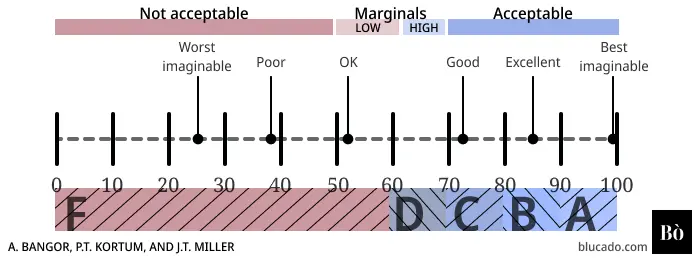
Aaron Bangor, Philip Kortum, and James Miller have correlated the numerical score of the SUS with a perceived adjective meaning. By asking users to both rate an application with the SUS and replying to the question “Overall, I would rate the user-friendliness of this product as: Worst Imaginable -> Best imaginable” they created a qualitative meaning of each score range (for example, a SUS score larger than 50.9 and less than 71.4 means that users perceive the usability of the application as “Good”). They then created a grading scale from F (SUS score < 60) to A (SUS Score >90) with all grades in the middle spanning 10 points. Presenting the grade instead (or alongside) a SUS score gives a qualitative understanding and comes in handy for setting KPIs.
Adjective
Mean SUS Score
Standard Deviation
Worst Imaginable
12.5
13.1
Awful
20.3
11.3
Poor
35.7
12.6
OK
50.9
13.8
Good
71.4
11.6
Excellent
85.5
10.4
Best Imaginable
90.9
13.4
Curved Grading Scale
Sauro and Lewis analysed 446 SUS studies (including the data from Bangor et al. above) and noted that the average of the SUS score from approximately 500 products is 68. They then created a curved grading scale that has 68 as the centre and provided with percentiles for each grade to enable comparison of a SUS score with that dataset of studies (for example, a SUS score of 79 is considered an A- which is assigned to a percentile range of 85-89. That means that the evaluated application with SUS score 79 has a better usability than at least 85% of the studies in the dataset; see also Quantifying the User Experience: Practical Statistics for User Research, Sauro and Lewis: 204).
SUS Score Range
Grade
Percentile Range
84.1–100
A+
96–100
80.8–84.0
A
90–95
78.9–80.7
A-
85–89
77.2–78.8
B+
80–84
74.1–77.1
B
70–79
72.6–74.0
B-
65–69
71.1–72.5
C+
60–64
65.0 –71.0
C
41–59
62.7–64.9
C-
35–40
51.7–62.6
D
15–34
0.0–51.6
F
0–14
How many participants should be included in a SUS test
Image courtesy of Thomas S. Tullis and Jacqueline N. Stetson
Can you change the word “system” in the SUS questions?
SUS is quite resilient to changes in the name of the “system”. Bangor et al. changed the word “system” to “product” and didn’t see a significant change in the results. This suggests that probably other, more specific, synonyms of “system” could be used safely.
Internationalised SUS vs non-native English speakers
The SUS is tested with non-native English speakers, and its reliability stays the same. However, several researchers have translated and validated SUS into local languages. If the participants are native speakers of a language other than English, it is worth considering using the local version of the SUS.
Does perceived Usability affect loyalty?
There exists initial data to support a link between the perceived usability of a system and users’ loyalty. Users who are promoters, measured with NPS, rate the system with substantially higher usability than passives and detractors. That could potentially indicate that improving usability could increase the likelihood of a user becoming a promoter.
User-centred design, user-centred approach, user-driven development, user-centric organisation, are all trying to describe the same phenomenon. An entity which performs design for a product, with high-priority consideration and constant input of the person who will use it. Furthermore, we see everyday more and more organisations converting themselves to being user-centric. So the question appears, what is user-centred design and how does it defer from other approaches on design.
“‘User-centered design’ (UCD) is a broad term to describe design processes in which end-users influence how a design takes shape. It is both a broad philosophy and variety of methods”
Essentially, user-centric design puts a name to the primal need that appears when starting to develop a product: what do the people who are going to use the product want? The differentiating characteristic of the user-centred process —over some other design process e.g. process-centred design— is the emphasis on including the user from early stages, while continuing to iterate over their needs throughout the whole process. Nonetheless, as with every movement, UCD evolved to represent a more humanistic approach to product design; by transferring the focus from process and business objectives to user needs.
User-centric design as a philosophy
Donald A. Norman pioneered in shaping the UCD to a set of axioms, all of which focus on one singularity; maximising usability. Developing a product with that constrain —maximisation of usability— refers some involvement with the following principles, that interestingly apply to both physical and digital products.
Visibility: The principle that the more visible an element is, the more likely users will know about them and how to use them.
Feedback: The principle of making it clear to the user what action has been taken and what has been accomplished.
Constrains: Limiting the range of interaction possibilities for the user to simplify the interface and guide the user to the appropriate next action.
Mapping: Having a clear relationship between controls and the effect they have on the world.
Consistency: Having similar operations and similar elements for achieving similar tasks.
Affordance: An attribute of an object that allows people to know how to use it.
Following the path carved by usability optimisation, implies a lean towards user empathy that a lot of the time goes against individual processes. This mentality reveals the fundamental humaine nature of user-centric design.
User-centric designs vs intuition
Intuitive products tend to have high usability, although the opposite is not always true; there are a couple of cases when initially non-intuitive products are designed in a way to maximise usability. A generic guideline of “design intuitive products” is not enough to guide a product.
In spite of the fact that user-centred design calls for creation of usable products, that could very well be intuitive products, it calls for the removal of the designer’s intuition. A product designed to be intuitive is done by understanding the user’s intuition; which most of the time is different from the designer’s. Different methodologies have been proposed to help identify what can be intuitive for the user. Usability tests, first-click testing, focus-groups, task analysis, are some examples of those methodologies.
Criticism
Lately more and more organisations are turning to be user-centred. However, user-centric design lacks a lot of business needs that might arise. A product designed just with the user-centric process doesn’t include the incentive of making money; as something might as well be extremely usable but to have almost zero business perspective. At the same time, usability is not what eludes the customers to start using a product, it is partly what keeps them. As a last note, the user-centric approach is not an equivalent of market research — it is a way of maximising usability for a product that is already conceived and validated.
A toy grabber — very profitable, little usable. Image courtesy Melvina Mak
Conclusion
User-centred design can be a very valuable process for creating products that have high usability. At the same time, it lacks business orientation. Maximisation of usability is one of the core values of user-centric design, whereas designs involve the user of a product throughout the design decisions.