Category: UX Guidelines

Topics and meta-analysis that regard user experience guidelines.

  • Size guidelines for text legibility

    Size guidelines for text legibility

    TL;DR: For creating a legible text use font size of 18 pixels or larger, with line spacing of at least 120% —with larger line spacings being more likeable. Adding at least some margin around the text, makes it more preferable.


    Deciding which font size to use can be an endeavour. Whether deciding for a blog post or a base font size for a design system, we have combined a list of relevant research and guidelines to help with.

    Which font size is the best for large texts?

    When the visitor’s goal is to gather information by reading (somewhat) large paragraphs, 18 pixels is the optimal font size. When testing eye fixation and subjective readability of text, Rello et al. found that as font size increases, the readability of the text increases as well [1]. This is backed by a huge body of research [2, 3]. However Rello et al uncovered that the readability uptrend ceils at about 18 pixels, whilst in larger font sizes (26 pixels) the readability flattens out and individual perceived readability may even worsen, although not in a statistically significant way. 

    Different font sizes taken from Google's Material UI.
    Material type system. Source: Material.io

    Which line spacing improves readability?

    A single number for line spacing can be a bit more tricky to answer. For starters, there seems to be no link between line spacing and readability [1,4] —starting at 100% line spacing and measuring upwards. However, there is data to support better text comprehension for line spacing starting from 120% to 200% (double spacing) [1]. At the same time, larger line spacing has been shown to improve subjective comprehension [1] as well as being preferred over smaller spacings; regardless of age people seem to prefer 1.5 and double spacing over regular [4]. Although the latter needs more research.

    Two versions of text. On the left with 120% line height, and on the right with 160% line height.
    Line height 120% vs 160%

    Small or big line length and what’s the difference with side margins?

    Line length can be a misleading measurement regarding readability. It can be measured either by physical width of the line (e.g. 600px) or numbers of words per line combined with the font size (e.g. 40 words with 18px font size). When talking about physical length of the line, there seems to be no correlation between readability and length [5] for medium sized lengths (extremely small and extremely large lengths are affecting readability negatively). From the same meta-analysis, we gather that more dense character spacing, resulting in larger line length, results in higher reading speed while not affecting readability. Nevertheless, increasing line length should come with an increase in line spacing; to aid with visual differentiation when needed to switch to the next line, so that readability will not be impacted [5].

    Side margins in text

    Side margins have been shown to not be the only determining factor for improving readability [6] However, there is a strong correlation of visitors’ subjective preference for text with large margins over text with no margin at all. Youngman and Scharff demonstrated that although the efficiency of reading stays the same between a 10 cm (4 inches) with various margins, and a 20 cm (8 inches) text without any margin, the people participating in the experiment rated the texts with margin as more likeable [6].

    Text with line height of 718px.
    Fixed line height
    Text with 100px side margins
    Side margins of 100 px

    References

    [1] https://www.superarladislexia.org/pdf/2016-Luz%20Rello-Big-chi.pdf 

    [2] https://d1wqtxts1xzle7.cloudfront.net/48796293/Readability_Subjective_Preference_and_Me20160913-23237-1flwrcn-with-cover-page-v2.pdf?Expires=1651143201&Signature=VbOIlZFKL2JZNbDdw8qI15t0AGLZ-o0HotkliySaZqC1HnwzwYey6QNkqqgY25m7tOMqjJgR4J~l2CyuY339aIYIjBMVrol8f6vhCqFjTddkUHXuh897u2x72S1DgwhMmGElk1xDPHuxw9MvBqRCPV7RTskarZKXV~hgy8-PzmpwVGyHm0QxEhW4VOnpqmugKvxkG6C9iU6ajDaZUGIlZkxBNqMuN2oXOetcmxMfWbXyotdiAg5rLcUKH6pkMFc-zk4mZePzruxIKGJQqwwKar0ZwSvdtrKx6P9BkD~a1UgMoXRLMuvlW4qkjgXzz~XgPrV4VG1rzgMQ5IPXgs4OAQ__&Key-Pair-Id=APKAJLOHF5GGSLRBV4ZA 

    [3] https://dl.acm.org/doi/10.5555/1531826.1531831 

    [4] https://dl.acm.org/doi/pdf/10.1145/2513383.2513414?casa_token=yVVBIE8FfI4AAAAA:xurY7S1gmwVVPPZErzt3PjeuKSA4iMY7nP9wo8_dAoOzA4MM1Dv-XAi-tr62Ea-IvqjySaUoRspc 

    [5] http://images3.wikia.nocookie.net/__cb20060729105544/psychology/images/e/eb/Dyson,_M_C_(2004).pdf 

    [6] http://www.lieb.com/Readings/Width.pdf 

  • Promo codes on checkout pages: Pros and cons

    Promo codes on checkout pages: Pros and cons

    TL;DR: Promo codes help visitors save money and increase sales for people already interested. Adding a promotional code to a design increases the likelihood of process abandonment, as people may wander off to another website in search of the code. Visitors that have a code could be more satisfied with their purchase, while those who don’t could be dissatisfied.

    “Few things stir up a consumer revolt quicker than the notion that someone else is getting a better deal”

    David Streitfeld

    Considerations regarding promo code addition to a design is a fairly common occurrence. However, promotional code inputs are a double sided sword. Following is a meta-analysis of reasons in favour and against the use of promo code inputs on a checkout page design, plus some solutions that are positioning themselves in between. Note that in the reasoning below, the promotional code addition on the checkout page is considered, and not in other places (e.g. on the landing page as a header, etc.)

    Promo codes for increasing sales

    Increase in sales volume is one of the first reasons behind the use of promo codes. The use of coupons in specific products has been documented to increase the likelihood of purchasing by 116% [3]. Though this is observed on people that are interested in the product beforehand. In the meantime, they could help boost interactivity of shops with specific audiences; increasing products viewed by 0.54% and the probability of purchase by 0.29% [3].

    In some cases, promo codes have been developed into a collective ecosystem managed by a third party organisation. Tools like Honey and Smart pass are either free or charging a monthly subscription (the latter) in order to provide their customers with a list of promotional codes. This process can be described as an affiliate program that could help with boosting individual sales. Furthermore, Behavioural Change Support Systems applied on these “affiliate” apps [4] provide an outsourced recurring sales increase.

    Practical implication of the usage of targeted promotional codes would be the development of strategic behaviours in order to acquire a given product or service at a reduced service [3], while not affecting visitors that wouldn’t already perform a purchase.

    Continuity in the checkout process

    Promotional codes are one of the little input fields that can break continuity of the checkout flow. Visitors whilst in the checkout process may initiate a search for a promotional code elsewhere, which can result in the abandonment of  the purchase [2]. This behaviour is more likely to be witnessed in audiences with higher technological knowledge [1]. However, the more experienced (technologically) customer is beginning to be the mainstream in the current years.

    Discount codes and customer satisfaction

    Relative satisfaction regarding a purchase is directly affected by the use of a promo code. In a design that contains the prompt of adding a promotional code —that being either just an input (pre-filled or empty) or a title hinting its use— we can categorise the visitors into two groups: those with the knowledge of the code and those who don’t.  When ‘fairness of price’ and ‘satisfaction’ are measured for those two groups it is found that visitors who know the code are satisfied with their purchase and believe that the price that they paid is fair, whereas for not-knowers satisfaction and perceived fairness hinders [1].

    Equity is the matter at hand in this case, as those who have a code may perceive themselves as special, and those who don’t may feel cheated. However, the former group’s satisfaction is relative to their expectations of the supply and effect of the  promo code. Consequently, dissatisfaction of the latter group is relative to their interest in acquiring a promo code.

    Good promo code designs

    Asos.com

    Asos.com hides the input behind a closed card. The most prominent action is the one of adding an email address. This could help with customer dissatisfaction, by moving attention away from the blank field (that is not shown). At the same time, the design doesn’t hinder discoverability for a customer that is willing to search for the promo code field (given the proper incentive).  

    Asos.com checkout page. In the top there is the country selection in a card. After that there is a card that is detracted with the title "promo/student code or voucher". Bellow that is the email address in a card.
    Same picture as before. This time the promo card is open and the input for adding the promo code is revealed.

    Myprotein.com

    Myprotein.com uses a banner on every page of their shop. Informing the customer about the currently active promo code. In the checkout page, the promotional code is automatically applied and its effects are clear.

    Myprotein.com landing page. Bellow the navigation and on top of the main picture banner, there is a smaller banner with the promotion text, including the promo code.
    Myprotein.com checkout page. When the visitor opens it, they see the product(s) they added. On top of the product there is a banner that says that the code was (automatically) applied and the totally percentage saved (50% in this case). On the product itself there is a green text informing of the 50% discount applied.

    References

    [1] https://citeseerx.ist.psu.edu/viewdoc/download?doi=10.1.1.14.9915&rep=rep1&type=pdf

    [2] https://www.sciencedirect.com/science/article/abs/pii/S074756321530025X 

    [3] https://www.anderson.ucla.edu/documents/sites/faculty/review%20publications/research/Dai_et-al_AlibabaCoupons_SSRN-id3029707(0).pdf 

    [4] http://ceur-ws.org/Vol-2340/03-BCSS2019_paper.pdf

  • When to use loading indicators (and which)

    When to use loading indicators (and which)

    TL;DR: Use a looped animation for waiting times between 2000ms and 10000ms. A progressbar is best to be used for waiting times from 10000ms to 30000ms. When the expected waiting time is more than 30000ms (half a minute) show a progress bar and a time-to-complete estimation, to inform the visitor when to come back.

    Looped animation indicator

    Looped animations are the easiest to implement from a development point of view —no calculation is needed. If the action is expected to take between 2000ms and 10000ms, a looped animation should help the visitor maintain the perception of a responsive system. Dialogue continuity has a ceiling of approximately 10s [2], assuming that an action is a dialogue between the machine (computer, phone, etc) and the visitor.

    A spinner
    Source: Material UI
    A spinner, in the form of a indefinite progress bar
    Source: Material UI
    Different sizes of static spinners
    Source: Fluent UI

    Progress indicator

    Progress indicators (that include a percentage-done) can be used when the expected waiting time is higher than 10000ms with a ceiling of 30000ms. The continuous feedback provides information about the status of the request, which can help extend the visitor’s maximum waiting time [3]. Progress indicators’ will also inform the visitor whether the system has become unresponsive [1].

    Stepped spinner with percentage in the middle.
    Source: Material UI
    Stepped progress bar with a percentage on the right.
    Source: Material UI

    Adding a time estimate

    Visitors will likely want to switch to another task while waiting for more than 30s [1, 3]. Adding an estimate of time-to-complete in longer than 30000ms waiting times will inform the visitor of when to return to the application.

    No loading indicator

    In situations where loading times are less than 2000ms, a simple state change of the button should communicate the responsiveness of the system. Adding a loading indicator in those cases could do more harm than good, as the visitor may get confused from the flicker of a new element [1]. 

    A note on micro indicators

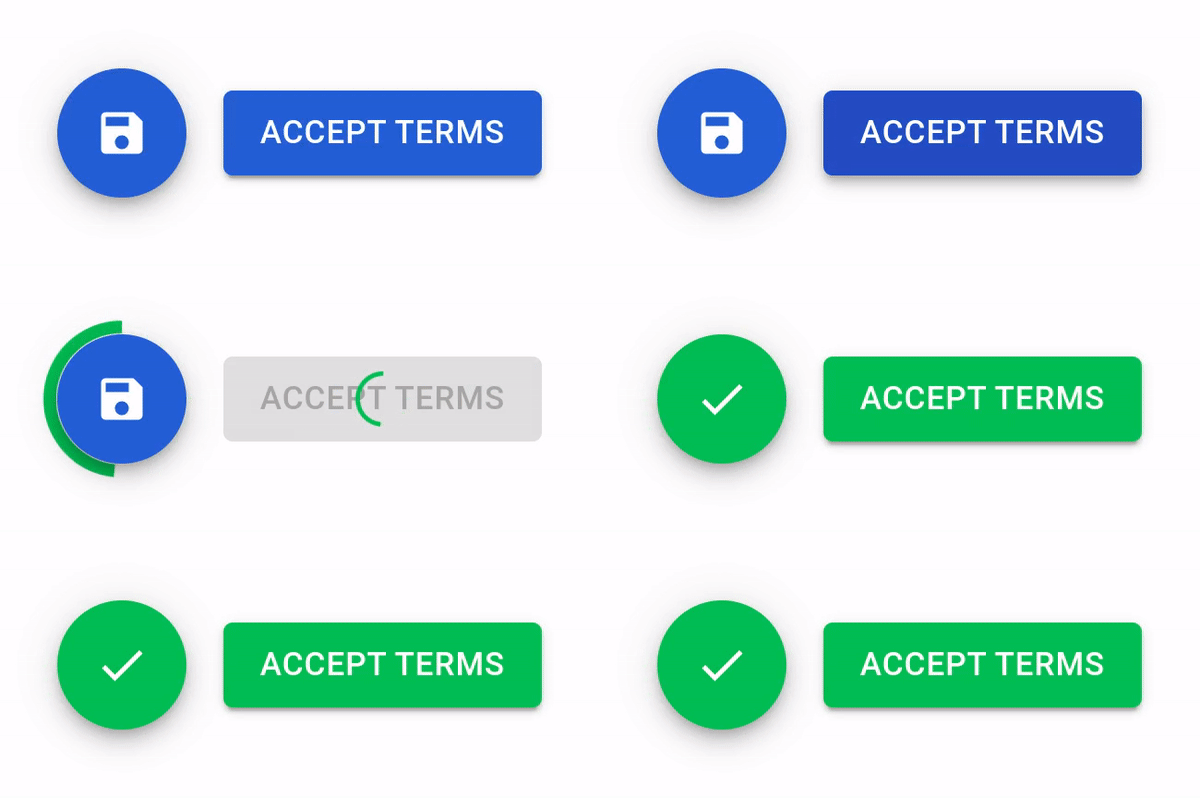
    Adding a loading indicator as a state update of the button could bridge the gap between the no loading indication and the spinner. As the indicator is perceived as a state update of an existing element, it could potentially minimize the probability of the visitor getting confused that they “missed something”.

    Buttons that when click are overlayed by a spinner and then turned green.
    Source: Material UI

    References

    [1] https://www.nngroup.com/articles/progress-indicators/

    [2] https://www.iamue.com/wp-content/uploads/2017/08/50720267.pdf

    [3] https://citeseerx.ist.psu.edu/viewdoc/download?doi=10.1.1.96.2367&rep=rep1&type=pdf

WordPress Cookie Plugin by Real Cookie Banner